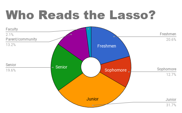
For any news source, it is crucial to understand the readership base and their opinions. From there, sources can evaluate and improve their content accordingly. These findings can reveal interesting information about the public and how it consumes media. The Lasso recently sent out reporters and conducted an online survey to learn about the readership of the Lasso. We gathered information from 189 people who read the Lasso, including students, parents, faculty, and community members. Here is what we found:

“Your stories are very interesting to read…It was awesome to read the different points of view that you get from the students! Keep up the amazing work!” – Caroline Poley, freshman.

I rarely read the Lasso because “I am very busy.” – Agnes Jagerskog, sophomore.
I rarely read the Lasso because “I do not know where the website is.” – Sonya Lu, junior.

“I think that the links on schoology are what makes students read it, otherwise I couldn’t see any student randomly looking up the Lasso in their free time.” – Emily Ives, freshman.


Evan • Apr 30, 2018 at 12:03 PM
First off, I would like to thank you for your close reading and willingness to respond to this piece. You represent a portion of our readership that is crucial to the success of the Lasso.
I completely see your point regarding the graph which depicts “Who reads the Lasso?” We could have contextualized these as percentages of these groups of people and represented this in a bar graph.
Regarding the statement that teachers are misrepresented, I think the point of the graph still stands. According to U.S. News Education, which provides news and rankings in education, the teacher to student ratio at GM is 1:11. Therefore, even when you take into account the differing number of teachers and students, the percentage of teachers that read the Lasso remains at just above one fourth of the students. While it is true that teachers are more disengaged than students, your statement rings true when it comes to parent and community engagement. There, they would technically be the most disconnected group of people. However, I think it is important to contextualize these numbers within reality. It is fair to say that teachers, who have a direct connection to the Lasso and its writing, should be more common readers of the Lasso than your average community member. As such, I think the statement that teachers are surprisingly disconnected from the Lasso remains a viable takeaway from our studies.
Regardless, we should ideally further contextualize and explain this data. I think part of the point of this piece was to present a concise and basic look at the readership of the Lasso, and this naturally created some areas of confusion. That being said, a more specific and analyzed approach, which might require unavailable resources, could potentially go unnoticed and unread. The information I presented in the past paragraph is enlightening, but is perhaps indigestible for your typical Lasso visitor.
As for the caption mistake, that is a simple publishing mistake and we have quickly adjusted that error. Again, thank you for your feedback and genuine response to the article.
Dean • Apr 27, 2018 at 12:46 PM
Although it is of relatively minor importance, I feel as though some of the groups were improperly represented, notedly the staff. I don’t doubt the fact that only two percent of traffic on Lasso articles can be attributed to the staff members. However, this doesn’t mean they are “the most disconnected” or anything of the sort; it is simply because there are fewer GM staff members than students (and by a large amount). Perhaps a series of pie charts depicting the percent of each group (juniors, seniors, staff, etc) that reads the Lasso would’ve been a more appropriate way of representing the groups. It could also be important to note that this method doesn’t reflect the size of each of the classes, either.
Also, maybe having editors read through articles before having them published would be a good idea, as there are a number of glaring mistakes. For example, the caption for the last pie chart is identical to the one before it, and has nothing to do with the actual information contained in the chart at all.
As you yourself said, “For any news source, it is crucial to understand the readership base and their opinions.” Doing so in a flawed manner and improperly representing the data might be even worse than not taking the information into account at all.