A complete review of 10 popular fonts
The extremely important, unspoken opinions that we all definitely have
March 25, 2021
Want to procrastinate writing that English essay by contemplating which font to use? Look no further! Members of The Lasso’s Features section review ten of the most popular fonts.
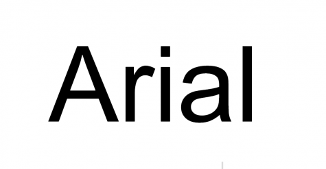
Elizabeth: To this day, I still cannot understand why Google Docs has this as their default font. This ugly font isn’t pleasing to look at, nor does it inspire me to write any essays. If Arial suddenly disappeared off the face of the Earth, I can’t say that I would be upset. 1/10
Emma: Disgusting. Google Drive should be embarrassed that this is their default font. It is ridiculous that students everywhere have to go through the laborious task of changing the font from Arial to Times New Roman every single time they write an essay. 0/10
Stella: I still remember the day when I discovered Microsoft Word on my dad’s computer at five years old. The very first thing I did was change the font to anything other than Arial, because even preschool Stella understood the very basics of style and class. The story I wrote (about a mermaid kingdom, if I remember correctly) was beautiful, and I absolutely refused to have it sullied by such an unoriginal, unappealing font. 0/10
Tucker: The final line of Elizabeth’s review, “If Arial suddenly disappeared off the face of the Earth, I can’t say that I would be upset,” means the world to me. This statement encapsulates everything I feel toward Arial. Complete and utter boredom. 1/10
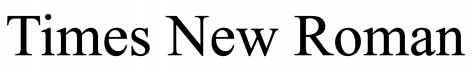
Elizabeth: Shoutout to Times New Roman for helping me write all of my essays over the course of my educational career. As soon as I open any document, I am already changing the font to Times New Roman, double-spaced, font size 12. Times New Roman just gives me a sense of comfort that cannot be experienced with any other font. 10/10
Emma: Perfection. The world just falls into place whenever I use Times New Roman. Easy 10/10.
Stella: The sight of Times New Roman evokes memories I’d rather not recall. Every time I’ve been pressured to write an uninteresting essay for the sake of a grade, this font has been complacent. I can’t put aside those awful flashbacks, so even if the style were mediocre, I couldn’t judge this font positively. 1/10
Tucker: “Double spaced, 12 pt, Times New Roman.” We have all heard this as our teachers explain an upcoming essay. This font is the standard for a reason. Times New Roman is easy to read, nice to look at, and the all-around perfect font. It’s the font generations of teachers have chosen, and for good reason. 9.4/10
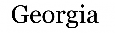
Elizabeth: Georgia is basically Times New Roman, so therefore I love this font. However, I am taking a point off simply because no font can ever replace Times New Roman. 9/10
Emma: This font is so bad. It’s like a mediocre cross between Times New Roman and Merriweather. Merriweather is superior, which may or may not have caused an embarrassingly long debate among Stella, Elizabeth, Tucker, and I. Clearly I have big opinions about this. I guess it’s a 4/10 but I’m just being nice. (Editor’s Note: Elizabeth, Tucker, and I are all fervent believers that Merriweather is simply an awful font, which is why it isn’t even included in this article.)
Stella: Is this not just a larger, slightly wider version of *fearfully whispers* Times New Roman? It’s slightly better than the aforementioned font-which-should-never-be-named, but isn’t spectacular. I suppose this would be a good font for basic writing, but not for presented works. 4/10
Tucker: Georgia is a wonderful font edging on perfection. Its beautiful swoops add intrigue to any piece. It is a perfect size between Times New Roman and Merriweather (pretty much the same font, but differently sized). Georgia manages to beat Times New Roman just because Google Docs standard size is 11. 10/10
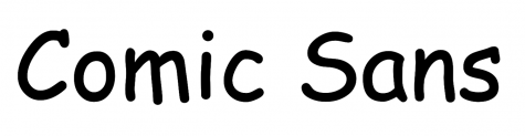
Elizabeth: This controversial font has been debated since the beginning of time. Unfortunately, I am ashamed to say that I used this font quite frequently from the ages of 10-13. While this font is extremely cringey, I don’t really have any strong feelings against it. 6/10
Emma: If you didn’t use this font in bright purple or green in fourth grade, we can’t be friends. Elizabeth, don’t be ashamed. It is not cringey. A solid 6/10.
Stella: I truly believe that the font someone chooses is an important indicator of their character. In this case, a user of Comic Sans is a boring person who tries to present a façade of fun. Maybe it’s a last-second switch to “spice up” a presentation with a white background, black text, and left-align (the most boring presentation format), or maybe it’s a premeditated decision to attempt to entertain readers. Either way, Comic Sans is the choice of people I would rather not spend time with. 0/10
Tucker: Whenever I see Comic Sans it takes me back to Señora Barry’s sixth grade Spanish 1A classroom, the walls plastered with spanish vocabulary posters in Comic Sans. One of the few things I remember from that class is the fateful afternoon where, sitting surrounded by ugly posters, I found out that One Direction had broken up. Comic Sans was an ugly font to begin with, but Señora Barry’s classroom made sure I could never see Comic Sans without a little twinge of sadness. 1/10
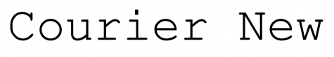
Elizabeth: This font is funky and futuristic. I vibe with Courier New’s aesthetic and could definitely add it to my font collection. 9/10
Emma: Don’t pretend that the only reason you use this font is to seem like a quirky journalist/news reporter or whatever. I would be lying if I said that I don’t still do this every once in a while. I agree with Tucker, it is very typewriter-esque. 8/10
Stella: I’d first like to point out to Emma that the four of us are in fact journalists, in case she forgot, but we do not use Courier New to write. I think this reminds me more of an Agatha Christie murder-mystery novel, probably because of the typewriter-esque feel like Tucker mentioned. It’s certainly fun to type with, but isn’t too fun to read. 6/10
Tucker: This is very typewriter-esque, which I can appreciate. However, I have some larger issues with this font. Its thin lines and large kerning (the space between letters) can make it difficult to read. Overall, it’s an okay font, but it has some technical issues. 3/10
Elizabeth: Bland, uninteresting, and doesn’t fill me with joy. Overall, just a boring font. 2/10
Emma: I literally have nothing to say about this. That just goes to show how irrelevant this font is, and if Google Drive deleted it tomorrow, everyone would be okay. Although, I am glad that this font brings joy to Tucker’s father. 2/10
Stella: Possibly the most mediocre font on the face of the planet. It’s not simplistic enough to be a minimalist font and it’s not flourish-y enough to be a decorative font. It’s just plain boring. 1/10
Tucker: This is my father’s favorite font. I understand it’s easy to read, thick enough to see and fairly simple. I appreciate everything this font is doing and, even though it isn’t my favorite, I love it for the joy it brings my father. 8/10
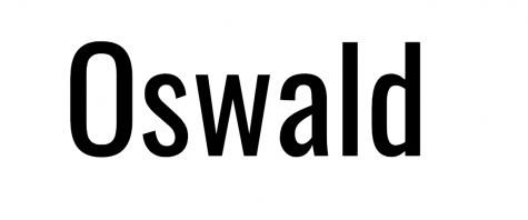
Elizabeth: I like this font and I’m not sure why. I also really like the word “Oswald.” I also used to watch the children’s show with the octopus that happened to be named Oswald as well. Anyway, that’s all for this review. 9/10
Emma: Why are all the letters so squished together?! Elizabeth, I also like the word “oswald” and SAME I WATCHED THAT SHOW ALSO! I think that is the only thing we can agree upon when it comes to fonts. 3/10
Stella: What reason could there possibly be to make a font so tall? Typically, the x-height (height of lowercase letters without ascenders/descenders, such as “s” or “w”) is half of the cap height (height of capital letters, such as “O”), but the makers of Oswald wanted to be bold. Straying from the social norm isn’t a bad thing in itself, but this makes the entire page feel too crowded. 0/10
Tucker: Looking at this font, no emotions present themselves. I think it could be better, but it’s also fine. 5/10

Elizabeth: Tucker actually taught me how to pronounce this font (treh-boo-shay), so I have been randomly yelling this word out during breakout rooms. Trebuchet is also a type of catapult. Anyways, Trebuchet is a pretty regular font, so do with this information as you please. 6/10
Emma: This font does not deserve such a fancy name for such a stupid style. But, honestly, it is a fun word to try to say. That’s it. 2/10
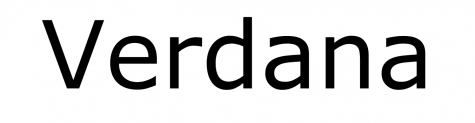
Stella: Even without the fun french pronunciation, this font is quite nice. I would be inclined to give it a higher rating if it weren’t for the odd changes in pen thickness, such as the bottom of the “b,” which particularly bothers me. 5/10
Tucker: I really cannot tell the difference between Trebuchet and Verdana. I think that Trebuchet is a little tighter and taller, which I like. Starting this review I didn’t have an opinion, but seeing it typed out, I really like the way this font looks. It’s clean and simple in a comforting way. 9/10
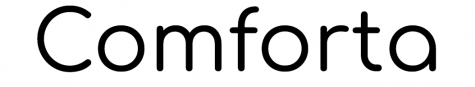
Elizabeth: Hands down, one of my favorite fonts. Comforta fills me with comfort (get it?) everytime I see it’s beautiful letters and I have used this font on countless Google Slide presentations. Simply put, Comforta is a supreme font and no one will convince me otherwise. 10/10
Emma: So, um, is this font’s goal to bring comfort? Well, it certainly does not comfort me when trying to cram that chem lab report in the night before it’s due. Very disappointing. 2/10
Stella: I was very skeptical at first, but overall, this is a fairly pleasing font to type with. Something about it’s roundness is oddly satisfying. That being said, I would never ask someone to read in Comforta, because it isn’t very nice to just look at. 5/10
Tucker: This font feels childish. It shares the energy of the neon pink slides template, something that 4th grade me would love, but current me can’t really get behind. 3/10
Elizabeth: Crafty girls is an incredibly ugly font, yet I still feel obligated to give them a few points based on uniqueness and their exciting name (Crafty girls? Seriously, whoever comes up with these names deserves some sort of award). 3/10
Emma: Petition to bring back the most popular font in fourth grade, please! This font, although frowned upon by english teachers everywhere, will provide a fun take on that essay you’ve been procrastinating. Who cares if it’s hard to read?! 10/10
Stella: I’ve never agreed with sorting people into definitive categories. There are so many wonderfully complicated aspects of life that prevent anything from being black and white. So, you must understand the severity when I say that there are two types of people in this world: those who used Crafty Girls in 2014 because they thought it was cute, and those who religiously employ the font in 2021 because they genuinely enjoy it. If you’re the latter type, then congratulations — I will be staying as far away from you as humanly possible (*cough cough* EMMA). 0/10
Tucker: Speaking of fourth grade me, this font was my everything. Its swirly letters sparked so much joy as I imitated the swirls in my own handwriting. Now, I find this font difficult to look at. (P.S. While writing this review in Crafty Girls, I had to retype the capitalized “N” four times because I thought it was not capitalizing. This font is disgusting.) 1/10


Laub • Mar 25, 2021 at 5:21 PM
Hearts all around!!❤️❤️❤️
These are the reviews I want.
TNR till I die. (But Oswald is pretty solid)