We need more student art around the school
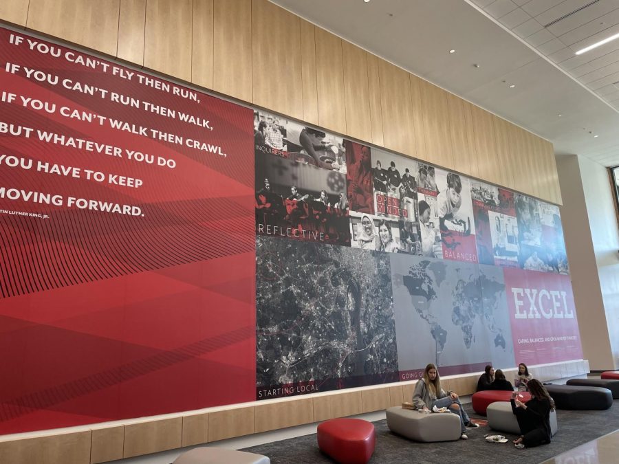
This design, which was added earlier this school year, takes up most of the wall space in the lobby of the school.
December 2, 2021
Last school year, The Lasso published this article about the endless blank walls and lack of decoration in the new school building. Students called for posters, art, or almost anything else to bring a little life to the hallways. Perhaps following these requests to spice up the school, new decals were added to the walls around the lobby. These designs feature pictures of students, inspirational quotes, and a variety of maps of the school and surrounding area.
In addition to the quotes and IB Learner Profile traits, the design has photographs of students and teachers who no longer go to Meridian and younger students from the elementary schools.
Students have a range of feelings about the new art.
“It’s a little strange seeing pictures of kids from 20 years ago,” senior Maeve Dodge said.
Junior Katie Rice felt strongly about this, saying, “I feel confused about why there are young children on the wall. I hate all the quotes. I wish that they would at least put pictures of high schoolers.”
Sophomore Thomas Davies called the art “unnoticeable” and junior Jill Mankofsky said, “I wish it felt like it actually related to Meridian High School.”
I couldn’t agree more with the peers I spoke to, and I wish that the students could add personal touches to the art around the building. Although I’m grateful for a bit of color, there are still plenty of blank, white walls that I think would make perfect canvases for student designed art. A staple of the old school building, and part of what made it so charming, was all of the art that covered walls, ceilings, and doors.
The art in the old school building ranged from helpful periodic tables and equations in science classrooms to charming paintings like a slightly warped Buzz Lightyear in the math hallway. All the art in that building was student designed and painted, whether it was the Pac-Man themed painting in the Hy-C classroom or the giraffe in the depths of the science hallways.
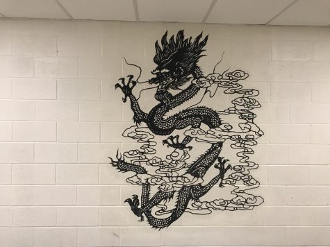
Large walls would be the perfect spaces for murals or local community art, and smaller areas could feature individual artist’s works. Meridian has an array of art students with talents and interests galore, and I think it would be a waste not to let them showcase their abilities and expand their canvases to the empty white walls of the building.
Students and teachers are the ones who spend the most time in the classrooms and hallways of the building, so it only makes sense for them to be able to add art that they enjoy looking at. The new building is in desperate need of personality, and student art is the perfect way to bring it.


